Horse & Human Foundation
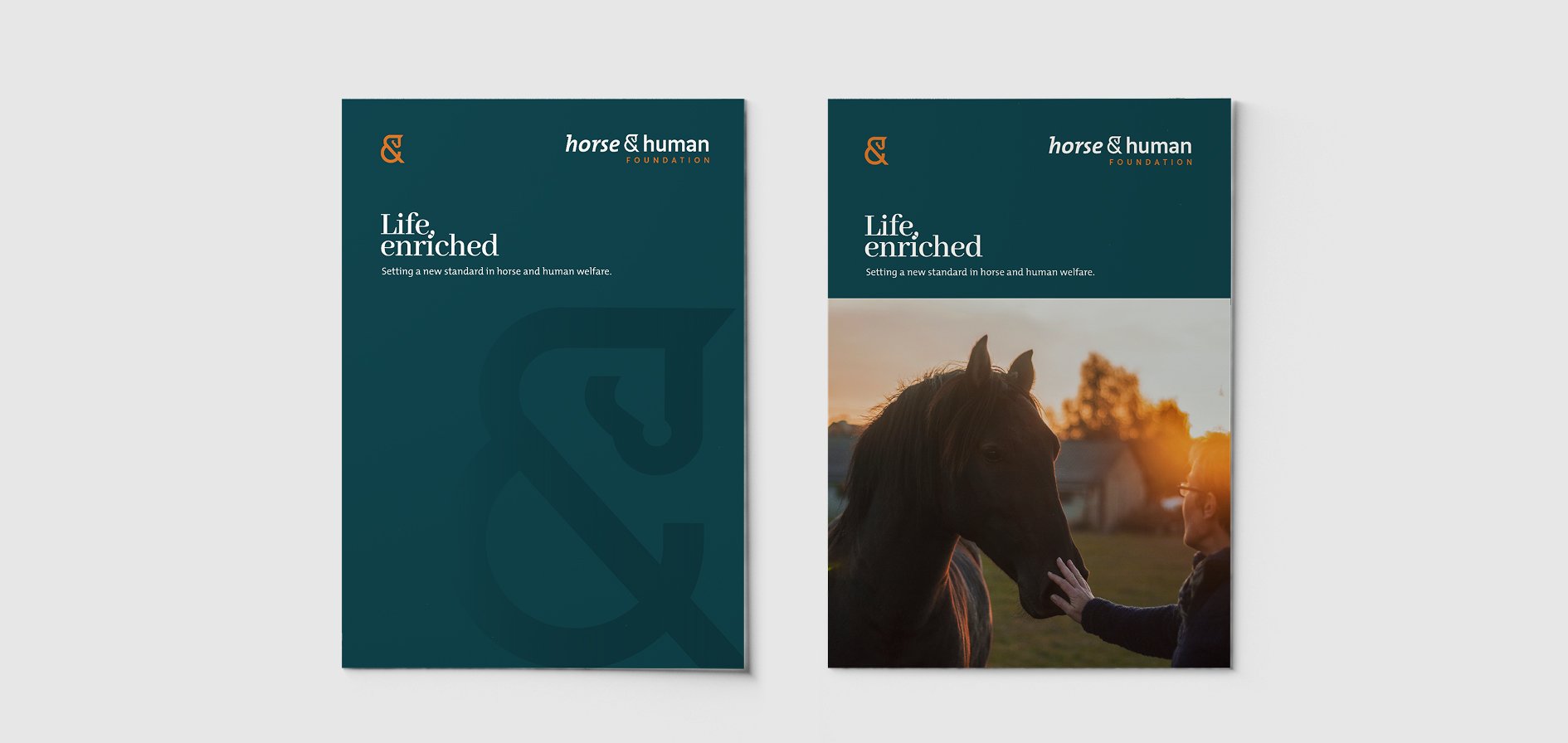
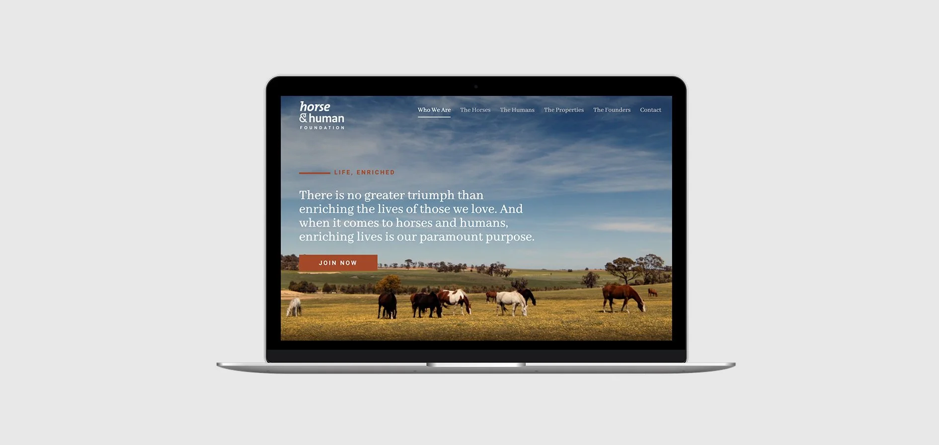
Life, enriched.
What We Delivered
Brand naming
Brand strategy & positioning
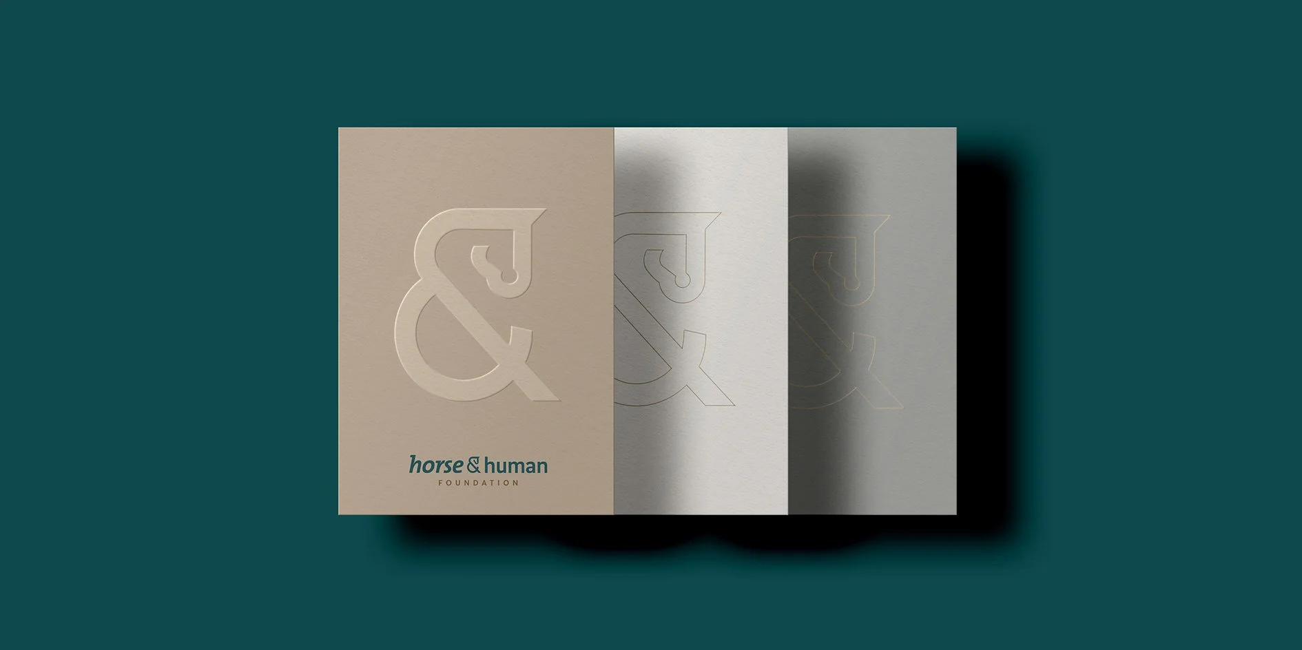
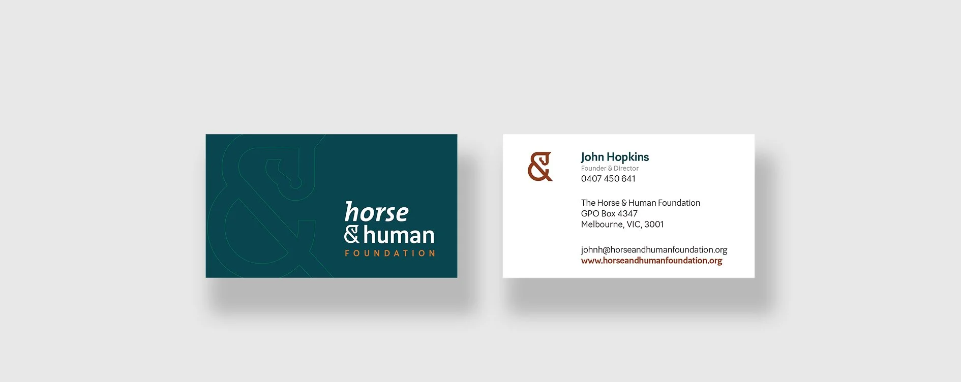
Visual identity system
Taglines, key messaging, copy
Image art direction
Website
Collateral suite (digital/print)
Raising the bar in welfare
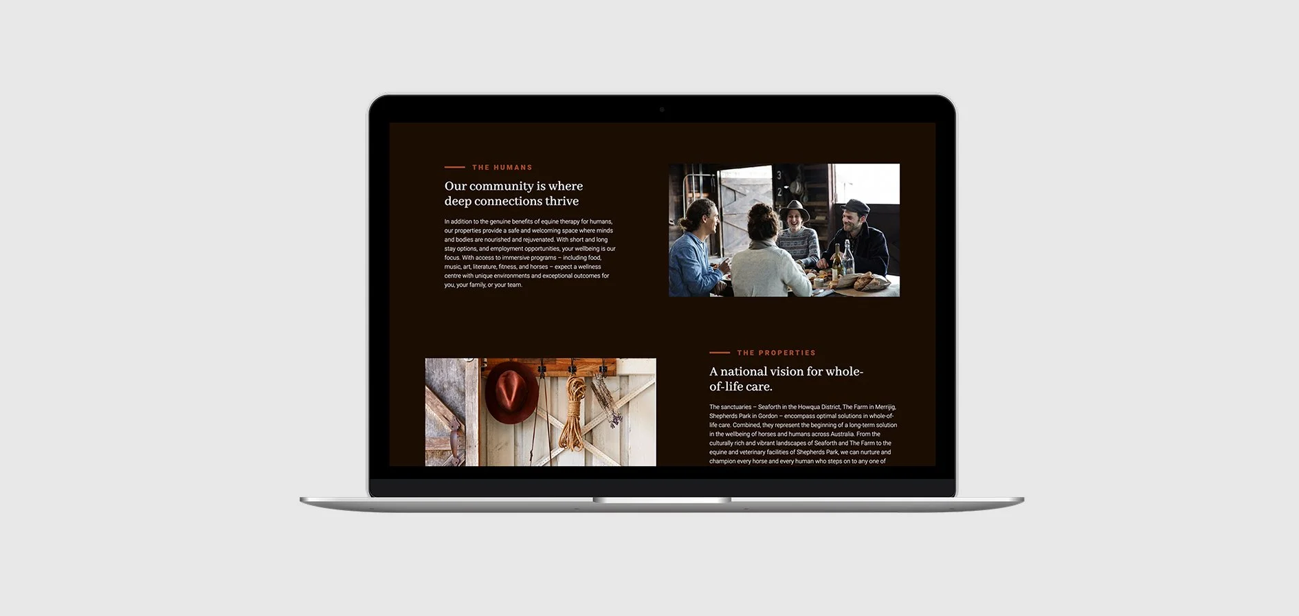
On developing a name, brand identity, key messaging, and website for this honourable not-for-profit, it was important the brand core echoed the same level of warmth and value the organisation intended - to enrich every thoroughbred and every person, raising the standard for welfare and community.
Conceptual design of the ampersand in the logo (interchangeable as both logo and as a refined watermark in design) subtly honours the elegant lines of horse and human, expressing the deep connection and empathy between the two entities. The palette draws on deep browns and aquas, echoing the landscapes at the heart of every story. The website – adopting texturally rich images amongst vibrant landscapes – incorporates crisp copy focused on connection, care, and loyalty to mission. Brand storytelling echoes the lived experience of both horses and humans, forging a visual and verbal link that continually reminds audiences what an enriched life really means.