QLD ArtsBook
A brilliant brand begins here
What We Delivered
Brand strategy & positioning
Discovery workshops
Brand voice guidelines
Brand pattern & graphics development
Logo & guidelines
Taglines, key messaging, copy
Website & member portal
Collateral suite (digital/print)
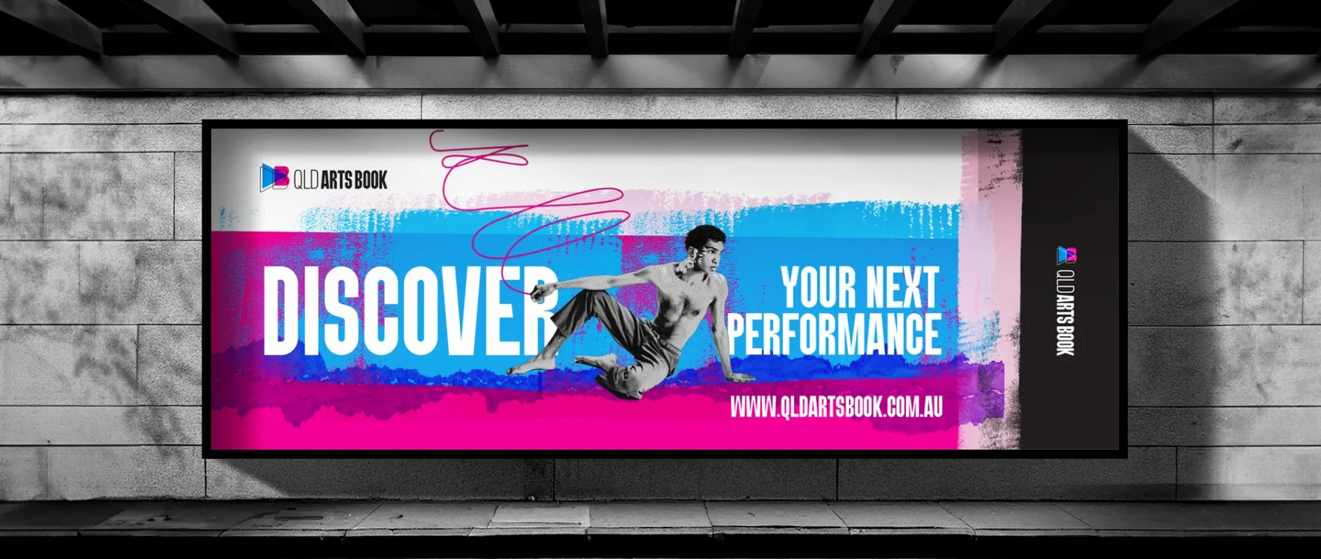
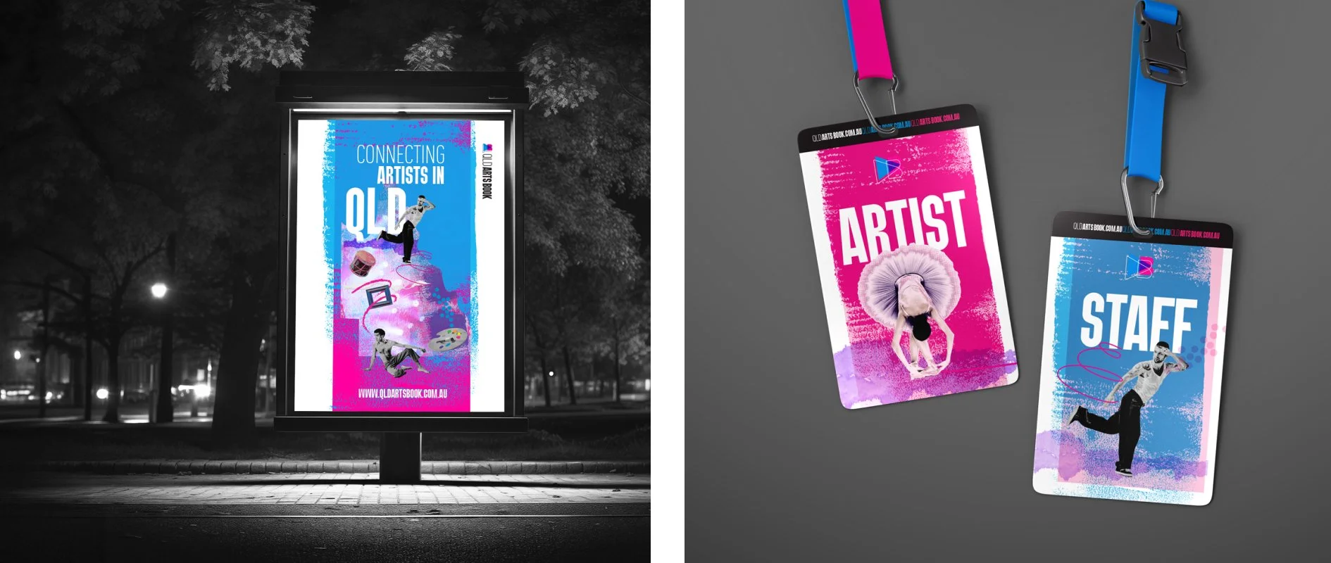
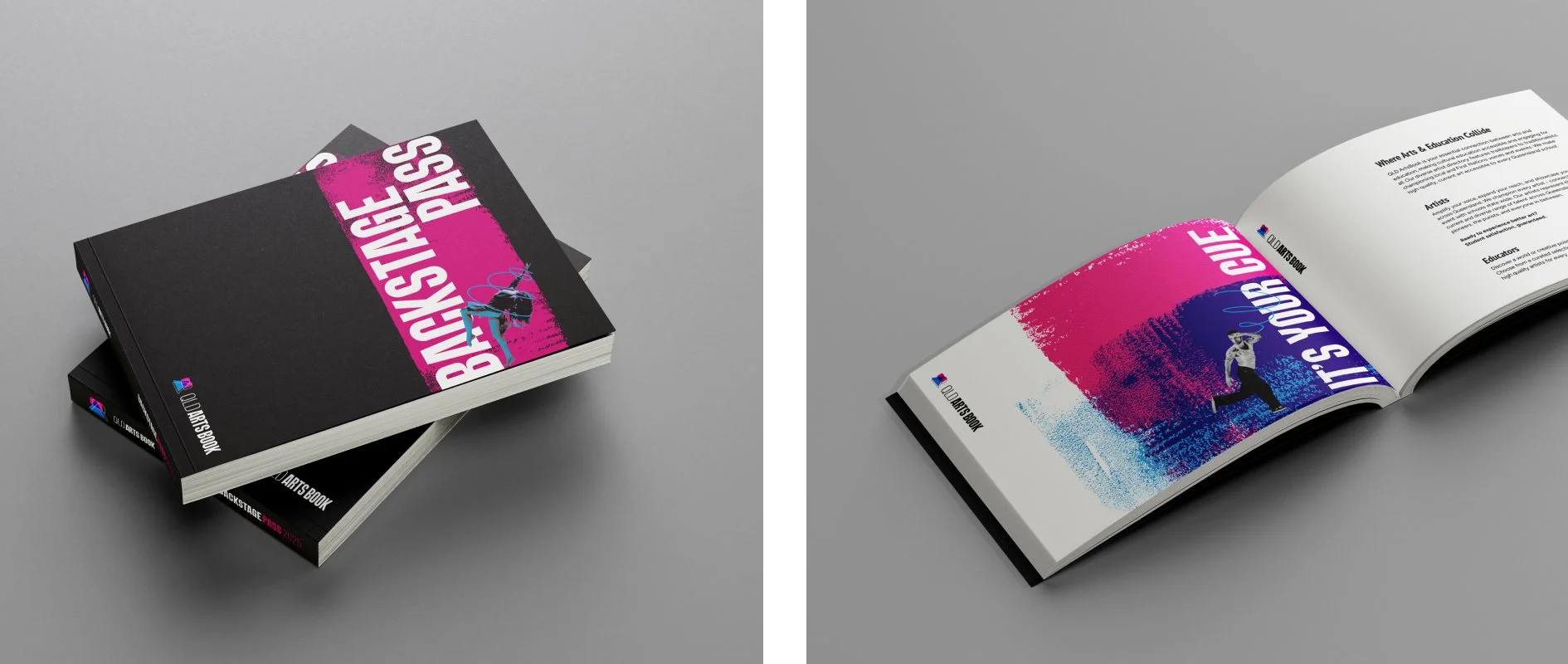
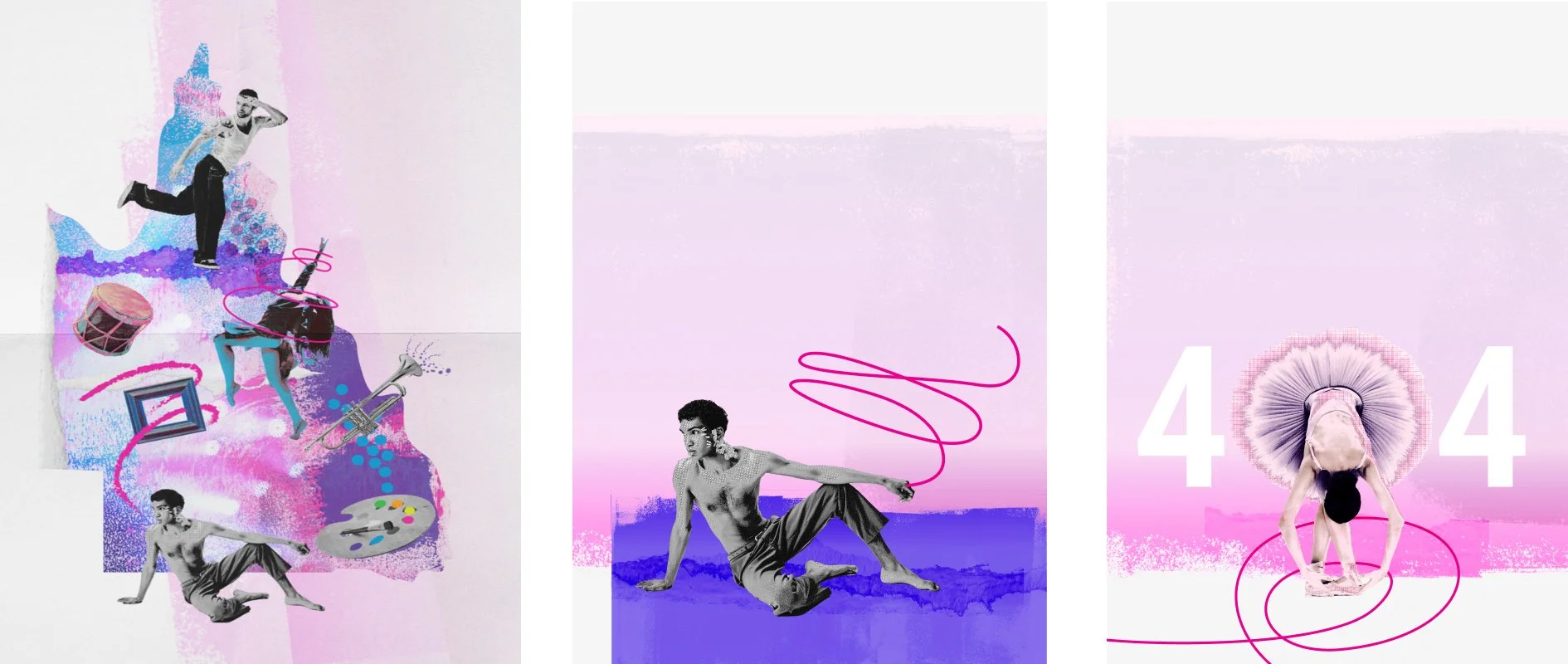
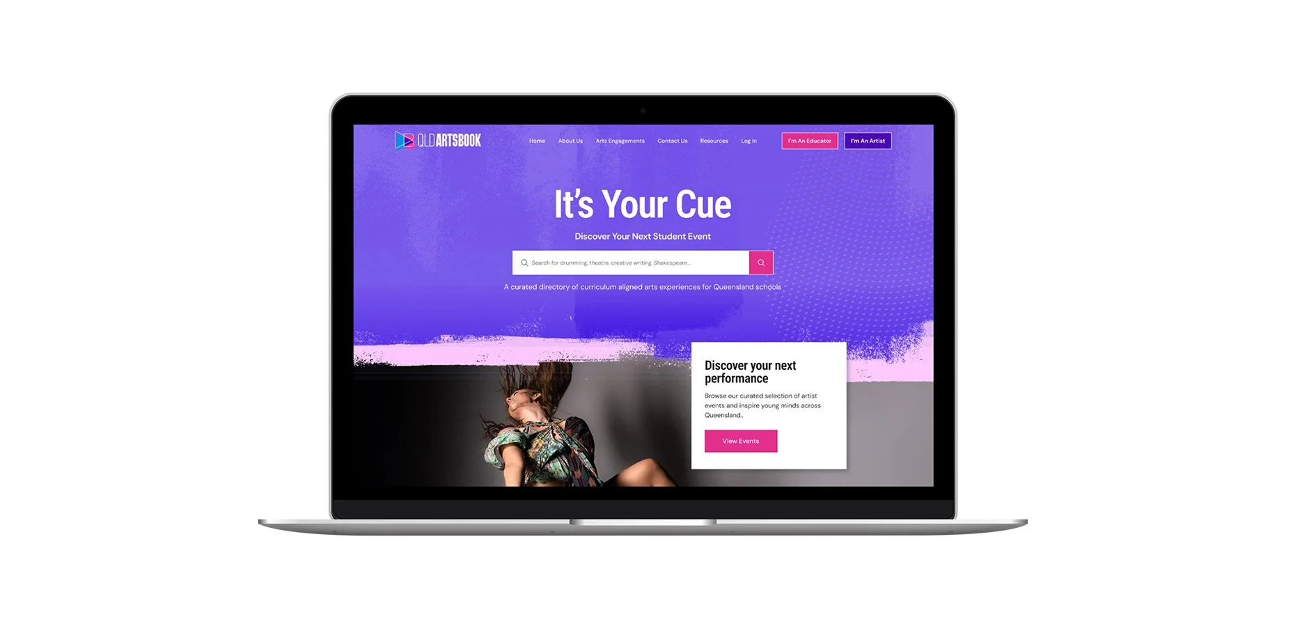
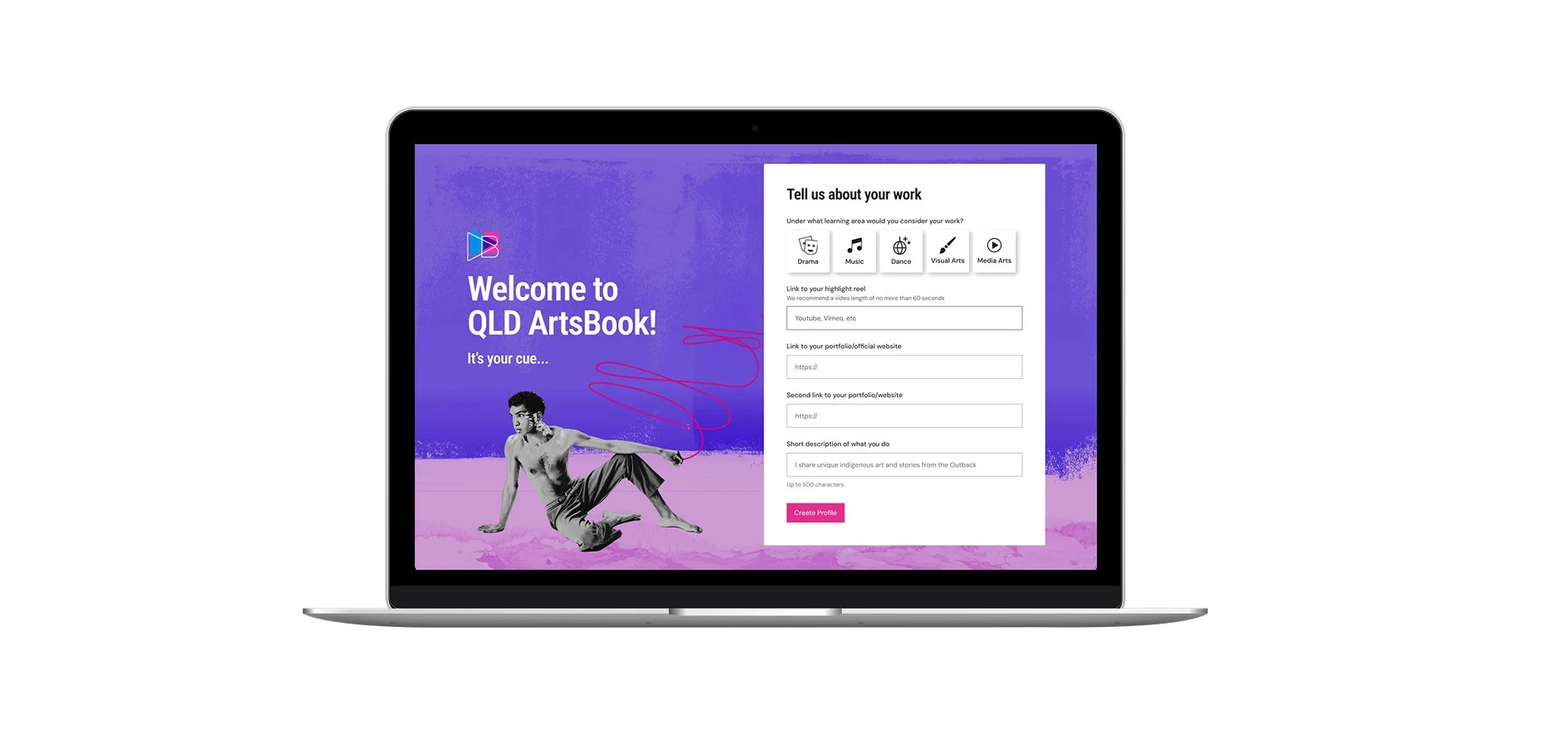
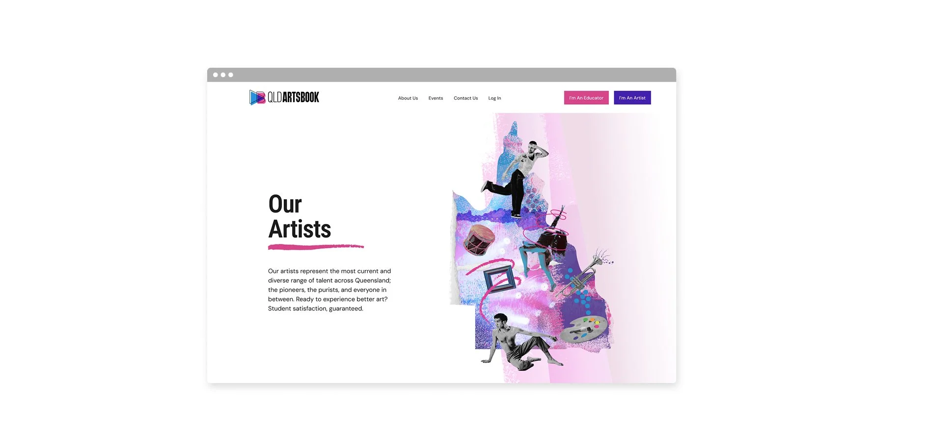
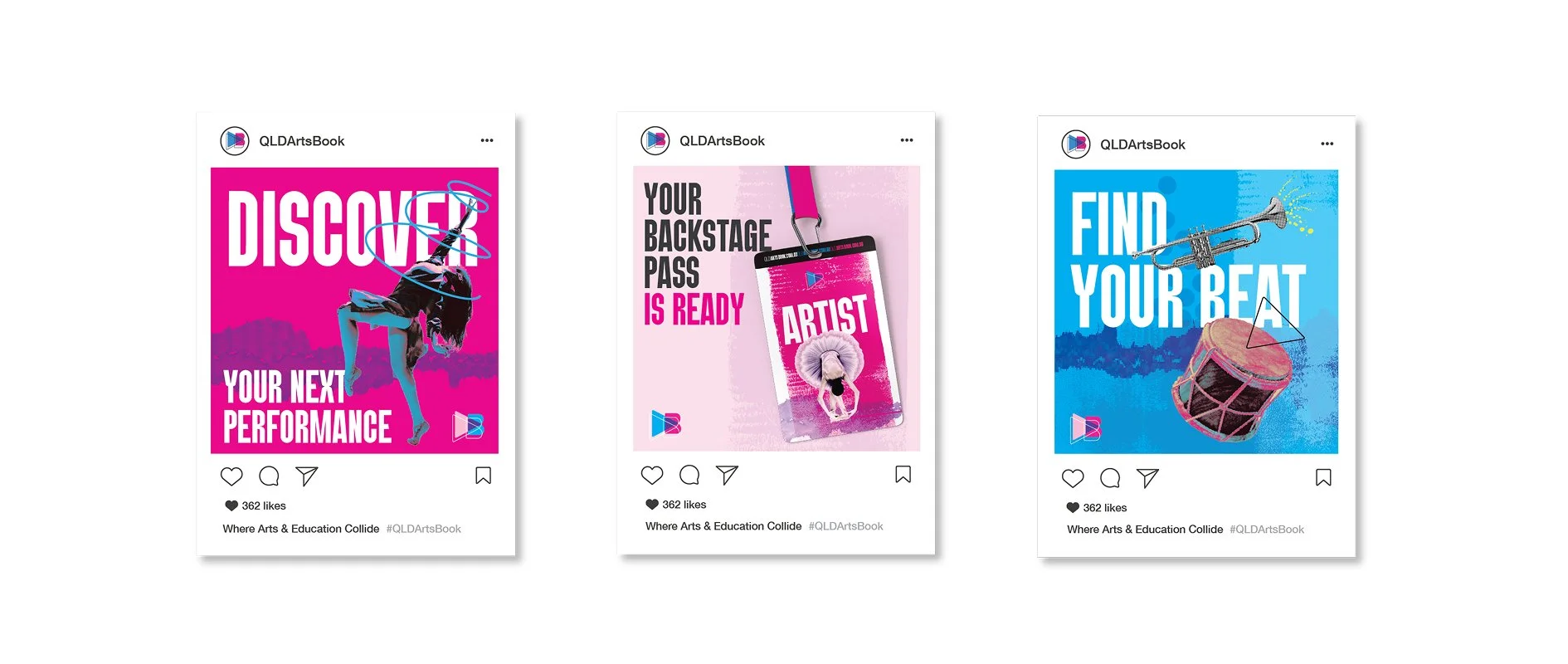
For this bold new brand and website, we set out to turn an ambitious vision into an accessible, dynamic arts platform for every school in Queensland. Creativity and connection is powered by purpose; we had a vision for the brand to curate something loose, illustrative, and unapologetically fun.
A name speaks a thousand words. Ideating QLD ArtsBook in a collaborative workshop - supported by deep research and our unique brand oracle process - was central to shaping a title that signals both clarity and creative possibility. The result? A name that stands as the state’s essential “little black book of the Arts” - inviting, trusted, and ready to open new doors. The visual identity system was charged with energy and inclusivity - drawing from pop culture and designed for genuine engagement across a broad, diverse state. Central to the brand was a custom design QLD map, layered with dynamic textures, hand-drawn icons, and a vibrant, retro inspired palette. The design is intentionally playful and nostalgic yet unmistakably progressive - honouring classic influences while looking ahead. copy brings the project’s playful spirit to life - bright, clear, and full of heart. Words were curated to invite our audience in, with language as vibrant as the art and voices it represents. Accessibility isn’t an afterthought, but a principle: every page speaks with creative clarity.